LOGO AND VISUAL IDENTIFICATION
SOPOT TOURIST ORGANIZATION
The Sopot Tourist Association decided to change the name to the Sopot Tourist Organization. Result of this change our Studio was asked to design a new sign, identification and the Book of Sign. We couldn’t be happier! We love Sopot and we treat it as the heart of the Tri-City. We had a lot of fun making this change and felt truly honored.

Change of name and sign
Changing the logo is a natural process when you are changing the name. Our design goal is to make the sign distinctive and to present the four essential elements of Sopot that have been building the image of this city for many years.

Symbols
The signet ring is a graphic representation of four symbols of Sopot: the Spa House, the Lighthouse, the famous Sopot Pier and the image of a seaside resort.
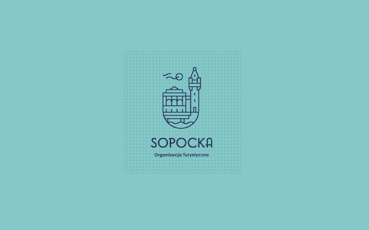
The construction of the signet is based on the classic modular mesh that can be seen on the right.
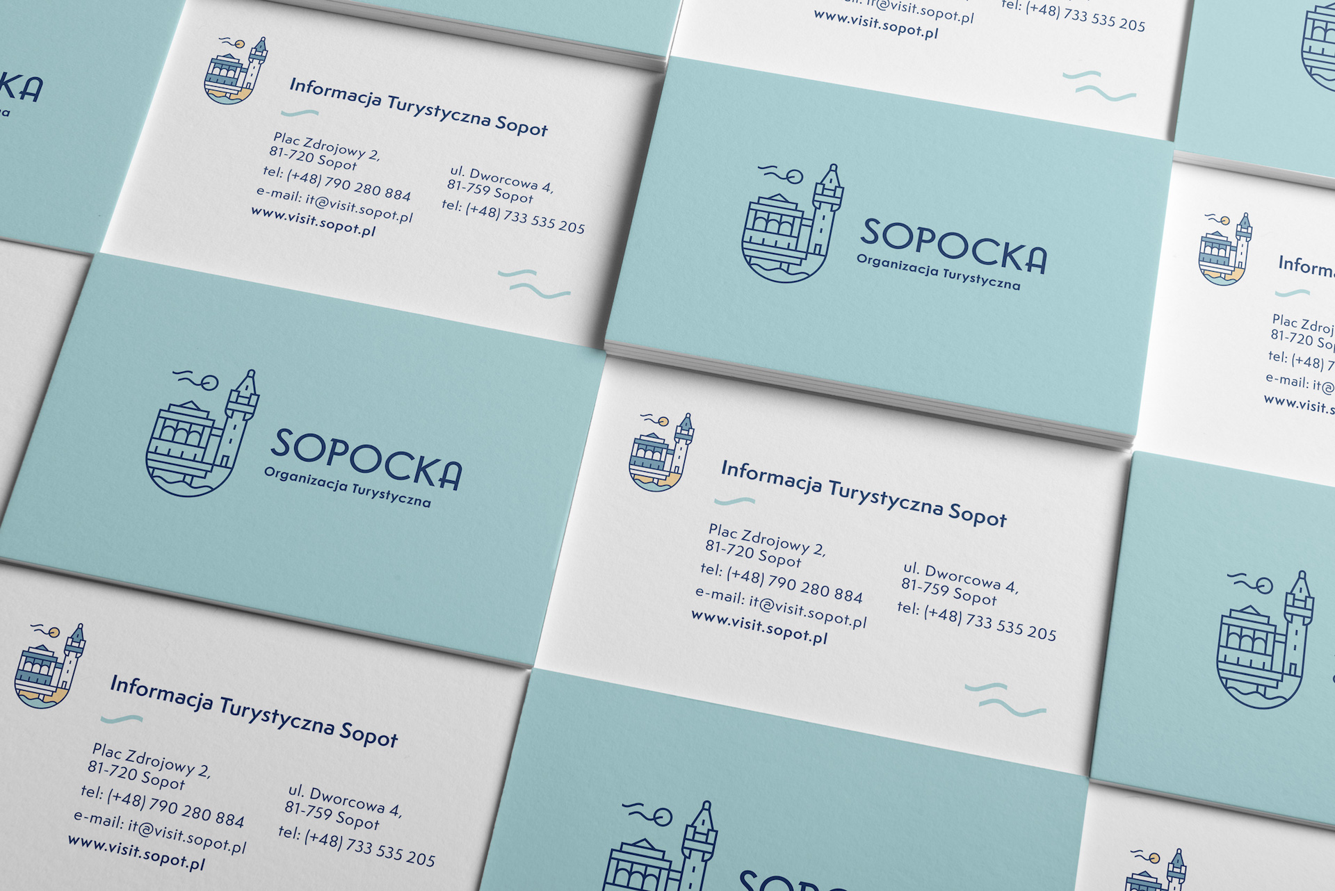
Visual identification project
Business cards are one of the basic materials of the visual language
Commercial products
The logo should be designed in a way that looks good in all areas where we want to use it.
