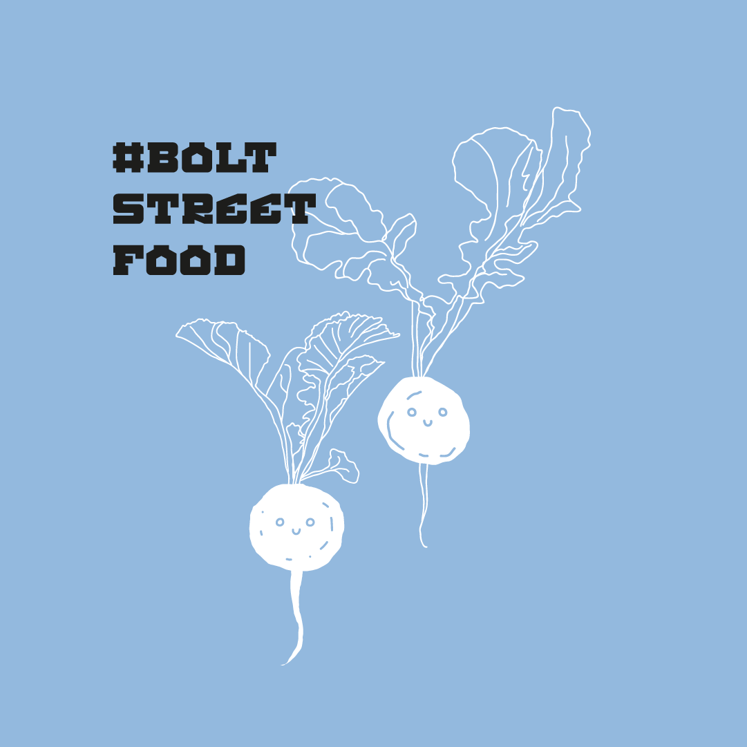
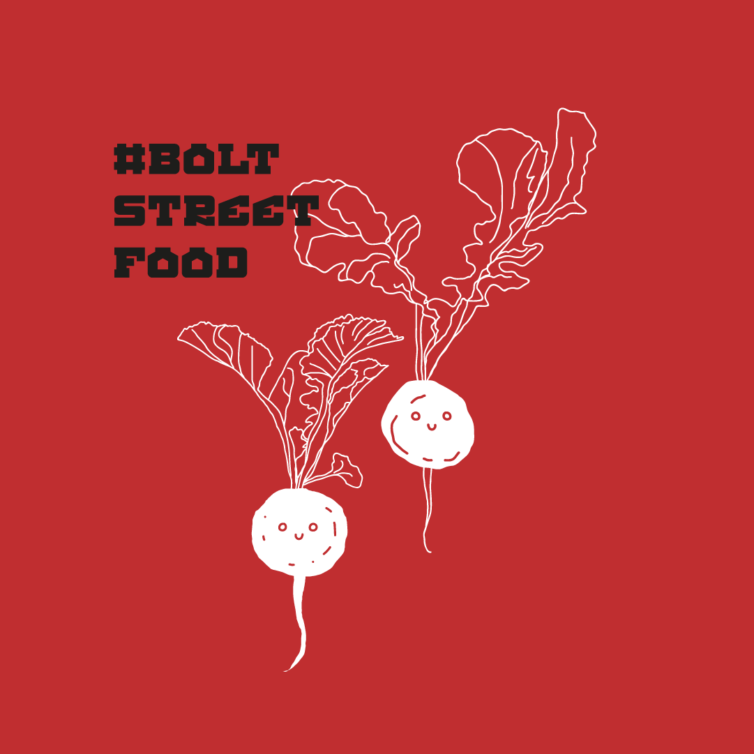
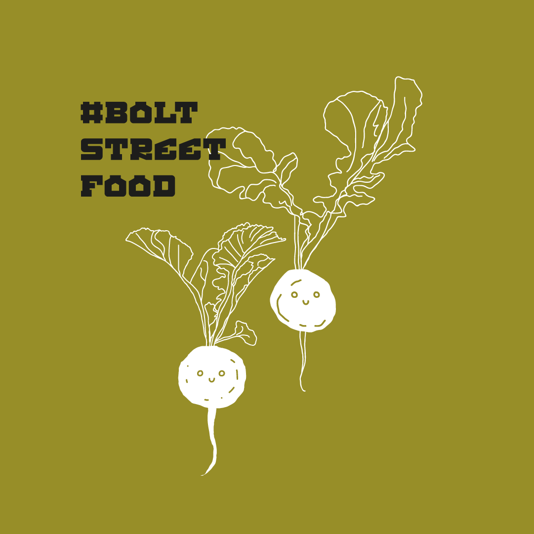
KEY VISUAL
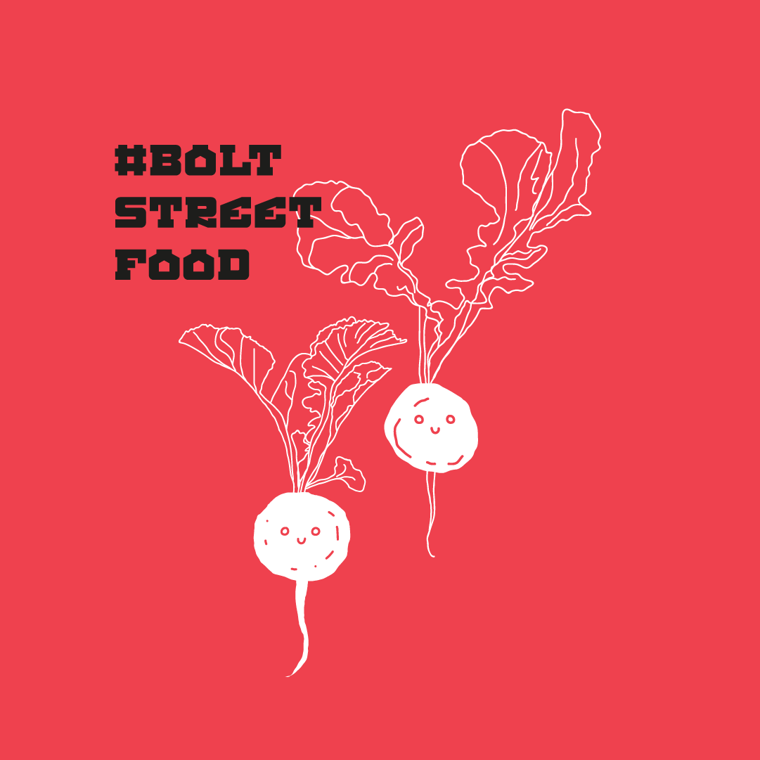
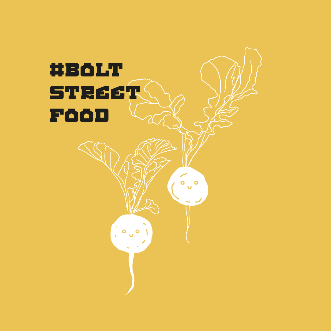
KASZUBSKI STREETFOOD
Dla lokalnej restaracji streedfoodowej Piotra Ślusarza opierającej się o nowoczesną kuchnię kaszubską zaprojektowaliśmy szereg fantastycznych materiałów i część z nich można nawet zjeść (no prawie). Zaprojektowaliśmy wszystko oprócz logo (które już było) co było wybitnie pysznym projektem!


Nowy Key Visual
Na początku zajęliśmy się całościowym pomysłem estetycznym, który zagrałby na wielu różnych przestrzeniach. Opraliśmy się o odręczne ilustracje, które miały obrazować osobistą pieczę właściciela nad menu restauracji. Kolejnym motywem wizualnym był słoik – ponieważ wraz z rozwijaniem się bistro Piotr chciał jeszcze dużo przed pandemią, aby jego dania można było skosztować na wynos.

Skąd te japońskie literki?
Do tych tradycyjnych elementów identyfikacji dobraliśmy dwa wyróżniające kroje pisma: jeden, który podkreślałby kaszubski charakter serwowanego jedzenia, drugi, który miałby być pasującym, ale ciągle niestandardowym rozwiązaniem typograficznym.


Co przygotowaliśmy?
Finalnie zaprojektowaliśmy drukowane menu, tablice z menu pionowym, szerek etykiet na słoiki różnej wielkości, kształtu i pojemności oraz elementy pod social media oraz stronę www.

Zdjęcia: Bôłt Streetfood Kaszebë oraz Stacja Food Hall