University of Gdańsk new logo
At the beginning of March 2021, we were invited to a closed competition to change the graphic symbol of the University of Gdańsk. Our proposal was considered the best for the implementation of a new logo and branding.
As a studio from Gdańsk, we felt very honored by the opportunity to participate in the creation of a new image of the University, which is very close to us, not only because of its location (our office is located in the same district;)), but also because of our earlier cooperation with the University’s Faculties and Publishing House.
Idea
When preparing our proposals for the design of a new logo, we followed the guidelines from the brief presented to us. The new logo had to meet a number of assumptions, including present the University as a strong and progressive academic center and enable the organization of the visual language of the University.
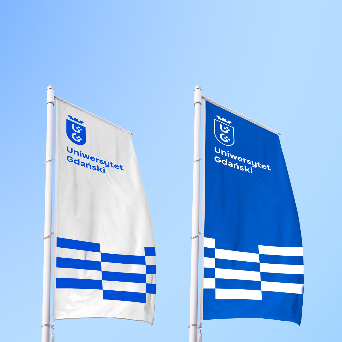
The design guidelines assumed, among others: starting from the heraldry of the city of Gdańsk (two crosses), legible letters “U” and “G” and colors referring to the sea. It was also very important to design the sign in such a way that it would look good on a small scale, e.g. on a business card, as well as in the form of a large sign on the building.
Progressive sign
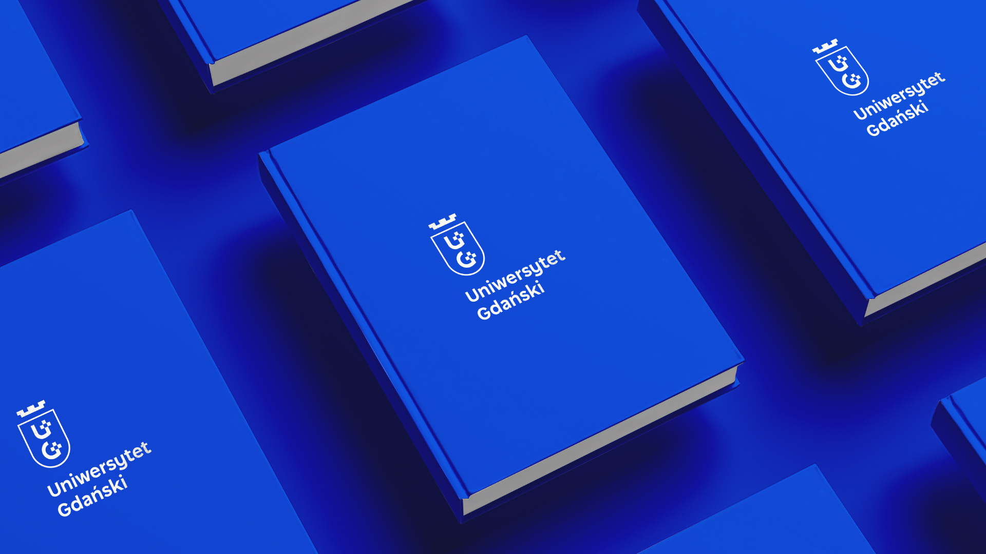
Our idea to create a concept corresponding to the needs of the University was to use modern and legible typography, strong, progressive color (intense ultramarine color) and an aesthetic and functional combination of the first letters of the University’s name with two vertical crosses on a modular grid. We have also used a negative space treatment, which gives the sign additional depth and provides the basis for building an interesting and timeless visual language.
Photo: Sylwester Ciszek
Logo for the next 50 years
By intensively working on the next elements of the University’s branding, we are looking forward to the final effect of the whole thing.
We hope that the new logo will be received positively – especially by employees and current and future students – and that it will fulfill its task for the next several or several dozen years.